The Hero Blues: The Sweeping Dominance of Cerulean, Cobalt, and Deep Ocean Blues
The color blue has long held a special place in design and human psychology, but in recent years, a specific family of blues has emerged as the undisputed hero of contemporary aesthetics. Cerulean, cobalt, and deep ocean blues have swept across industries—from fashion and technology to interior design and branding—creating a visual landscape dominated by these sophisticated, commanding shades. This phenomenon, often referred to as the “hero blues,” represents more than just a trend; it reflects deeper cultural shifts, psychological preferences, and the evolving nature of modern design.
Understanding the Hero Blues: A Color Spectrum
Before diving into why these blues have become so dominant, it’s essential to understand what distinguishes them from other blue variations. Cerulean blue, derived from the Latin word “caeruleus” meaning sky-colored, represents a bright, clear blue with green undertones. Cobalt blue, historically used in ceramics and glass production, features a deeper, more saturated tone with slight purple undertones. Deep ocean blue encompasses the richest of these hues, capturing the mysterious depths of water and suggesting both tranquility and strength.
What unites these hero blues is their psychological impact: they simultaneously project confidence and calm, sophistication and accessibility. Unlike pale sky blues that feel delicate or neon blues that feel aggressive, these medium-to-deep blues occupy a sweet spot in the color spectrum that appeals to designers across virtually every industry.
The Psychology Behind the Blue Dominance
The ascendancy of hero blues in contemporary design isn’t accidental—it’s deeply rooted in human psychology and cultural preferences. Blue remains the most universally loved color across cultures, associated with trust, stability, and intelligence. In an increasingly uncertain world, brands and designers have gravitated toward colors that communicate reliability and professionalism.
The specific dominance of cerulean, cobalt, and deep ocean blues likely stems from their ability to convey multiple meanings simultaneously. These shades evoke nature—the sky and sea—without feeling overly romantic or nostalgic. They communicate innovation without the coldness of pure navy, and they offer sophistication without the stuffiness of traditional corporate blue.
Furthermore, these hero blues photograph exceptionally well. In an era where visual content dominates digital platforms, designers have discovered that cerulean and cobalt render beautifully on screens, maintaining their integrity across different devices and lighting conditions. This practical advantage has reinforced their adoption across digital-first industries.
Hero Blues in Technology and Corporate Branding
The technology sector has been particularly instrumental in popularizing hero blues. Major tech companies have embraced various shades of cerulean and cobalt in their visual identities, packaging, and user interfaces. These blues convey the technological sophistication and trustworthiness that consumers seek in digital platforms, while maintaining approachability.
From startup logos to established corporate identities, hero blues have become the default choice for companies wanting to project innovation coupled with reliability. The shade communicates that a brand understands cutting-edge technology while remaining grounded in stable, proven principles. This psychological messaging has made cerulean and cobalt invaluable in competitive markets where differentiation is challenging.
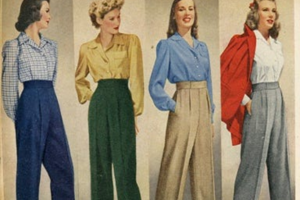
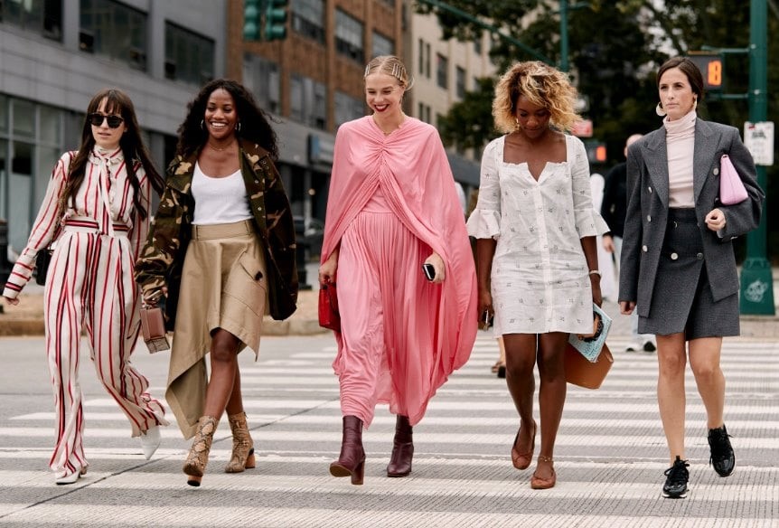
Fashion and Luxury: The Blue Revolution
The fashion industry has experienced a significant shift toward hero blues, particularly in luxury segments. Major fashion houses have incorporated deep ocean blues, cobalt, and cerulean into their collections, seasonal palettes, and flagship store designs. These blues have proven particularly effective for creating a sense of prestige and exclusivity.
Unlike trendy colors that fluctuate with seasons, hero blues offer designers a sophisticated anchor color that feels both contemporary and timeless. Whether appearing in haute couture, ready-to-wear collections, or accessories, these shades provide visual consistency while allowing for creative experimentation through complementary colors and textures.
The dominance of hero blues in fashion reflects a broader move toward intentional color curation rather than reactive trend-following. Designers recognize that these blues transcend temporary fashion cycles, offering longevity and investment value that consumers increasingly seek in their wardrobes.
Interior Design and Architectural Applications
Interior designers and architects have embraced hero blues as essential tools for creating contemporary yet timeless spaces. These shades work effectively as feature wall colors, in accent pieces, and across entire room schemes. The versatility of cerulean, cobalt, and deep ocean blues allows them to function in minimalist modern interiors, maximalist eclectic spaces, and everything between.
In commercial interiors—particularly offices, hospitality venues, and retail spaces—hero blues have become standard choices for creating environments that feel professional yet creative, calming yet energizing. These blues work harmoniously with natural materials like wood and stone, and pair beautifully with metallic accents ranging from warm copper to cool silver.
The architectural community has similarly embraced these blues for exterior applications, using them to create striking visual statements that age gracefully and maintain vibrancy even as weathering occurs.
Digital Design and User Interface Trends
Web designers, app developers, and digital product teams have consistently chosen hero blues for user interfaces and brand experiences. These shades function exceptionally well as primary brand colors, call-to-action buttons, and interactive elements. The dominance of hero blues in digital spaces reinforces their cultural visibility and influences expectations across physical design domains.
The success of hero blues in digital design stems partly from their contrast properties and legibility. Whether used as backgrounds or as accent colors, cerulean and cobalt maintain excellent visibility across different screen sizes and viewing angles. This technical advantage has cemented their position as go-to colors for designers prioritizing user experience.
The Sustainability Connection
An emerging factor in the dominance of hero blues relates to sustainability consciousness. These blues naturally evoke water and ocean preservation, making them popular among eco-conscious brands seeking to communicate environmental values. The deep ocean blue, in particular, has become associated with marine conservation efforts and sustainable practices.
This psychological association has made hero blues strategically valuable for brands positioned around sustainability, whether in fashion, packaging, or product design. Consumers increasingly interpret these colors as signals of environmental responsibility and ethical manufacturing practices.
Cultural and Historical Context
The hero blues phenomenon doesn’t exist in a vacuum; it’s connected to historical precedent and cultural evolution. Blue pigments have been valuable throughout history—cobalt was famously rare and expensive, making it a symbol of luxury in ceramics and fine arts. This historical prestige continues to inform contemporary perceptions of deeper blue shades.
Additionally, our contemporary moment—marked by digital saturation, information overload, and environmental anxiety—naturally gravitates toward colors associated with calm, clarity, and connection to nature. Hero blues satisfy this psychological need while simultaneously signaling progress and sophistication.
The Future of Hero Blues
As we look forward, the dominance of hero blues shows no signs of diminishing. Rather, we’re likely to see further refinement and specialization within the blue spectrum, with specific cerulean, cobalt, and ocean blue shades becoming associated with particular industries, generations, and aesthetic movements.
The democratization of these colors—their availability across price points and accessibility to designers globally—means they will likely remain central to design conversations. However, as hero blues become ubiquitous, innovative designers will inevitably explore contrasting palettes and overlooked color families, potentially creating space for cyclical trend evolution.
Conclusion
The sweeping dominance of cerulean, cobalt, and deep ocean blues represents a fascinating convergence of psychology, technology, cultural values, and aesthetic preference. These hero blues have transcended fashion trends to become fundamental elements of contemporary visual culture, appearing across industries and contexts with remarkable consistency.
Their success reflects our collective desire for colors that communicate trustworthiness and innovation simultaneously, that connect us to nature while propelling us forward, and that feel both timeless and thoroughly modern. As we continue navigating an increasingly complex visual landscape, hero blues will likely remain the go-to choice for designers and brands seeking to make sophisticated, confident statements about their values and visions.
Whether you’re drawn to the bright clarity of cerulean, the rich depth of cobalt, or the mysterious pull of deep ocean blue, these hero colors continue to shape the visual world around us, proving that sometimes the most powerful design choices are beautifully simple.