Introduction
Color is one of the most powerful elements in fashion design. It can evoke emotions, create illusions, signal social cues, and ultimately define a designer’s signature aesthetic. While textures, silhouettes, and cuts are all essential in fashion, color speaks first—and loudest. Understanding color theory enables fashion designers to craft collections that not only look stunning but also resonate emotionally and psychologically with their audience.
- Understanding Color Theory
Color theory is a framework that explains how colors interact with each other and how they are perceived by the human eye. It encompasses a variety of elements such as the color wheel, color harmony, the psychology of color, and how colors can be mixed or contrasted effectively.
The Color Wheel
At the core of color theory is the color wheel, developed by Sir Isaac Newton in 1666. It arranges colors in a circle, showcasing the relationship between primary (red, yellow, blue), secondary (green, orange, purple), and tertiary colors (a mix of primary and secondary colors).
Understanding the color wheel helps designers:
- Create balance and harmony
- Select contrasting or complementary colors
- Develop cohesive palettes for collections
- The Psychological Impact of Color
Every color carries an emotional weight, whether it’s rooted in cultural symbolism or human psychology.
| Color | Emotion/Meaning |
| Red | Passion, energy, power |
| Blue | Calmness, trust, stability |
| Yellow | Happiness, warmth, optimism |
| Green | Nature, growth, tranquility |
| Purple | Royalty, luxury, creativity |
| Black | Sophistication, mystery, authority |
| White | Purity, innocence, simplicity |
Designers use this psychological insight to craft narratives through their garments. For instance, a collection inspired by empowerment might use bold reds and blacks, while a summer resort line might lean into calming blues and greens.
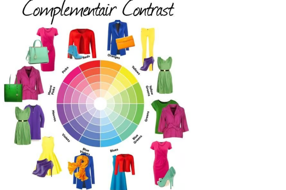
- Color Harmony in Fashion Design
Color harmony refers to aesthetically pleasing color combinations. These combinations can:
- Highlight a silhouette
- Emphasize details
- Guide the viewer’s eyes strategically
Types of Harmonies:
- Complementary Colors: Opposite on the color wheel (e.g., red & green). They create high contrast and vibrant looks.
- Analogous Colors: Next to each other on the wheel (e.g., blue, blue-green, and green). These are harmonious and pleasing.
- Triadic Colors: Evenly spaced on the wheel (e.g., red, yellow, and blue). These offer bold but balanced visuals.
- Monochromatic Colors: Variations in lightness and saturation of a single color. This creates a clean and elegant effect.
Fashion designers manipulate these harmonies to maintain interest while avoiding visual chaos.
- Seasonal Color Palettes
Each fashion season is typically defined by a specific color story. These palettes are influenced by:
- Pantone Color of the Year
- Runway trends
- Cultural and economic mood
- Environmental factors
Spring/Summer collections often include:
- Pastels
- Bright florals
- Warm and sunny tones
Fall/Winter collections favor:
- Jewel tones
- Earthy hues
- Deeper, richer colors
Designers must carefully consider how color fits not just thematically, but also seasonally.
- Cultural and Regional Color Significance
Colors do not hold the same meaning globally. For fashion designers targeting international markets, it is crucial to understand cultural perceptions.
- White symbolizes purity in Western weddings but is worn at funerals in some Asian cultures.
- Red is lucky and festive in China but can signify danger in other contexts.
- Black is chic and formal in many Western settings but may represent mourning elsewhere.
When designing for a global audience, sensitivity to cultural associations with color can prevent misunderstandings and enrich the design narrative.
- Gender and Color Perceptions
Traditionally, pink was associated with femininity and blue with masculinity. However, modern fashion challenges these notions, especially with the rise of gender-fluid and unisex fashion.
Designers now use color as a form of rebellion or inclusion. Breaking color stereotypes can offer fresh perspectives and resonate with younger, socially-conscious audiences.
- Sustainable and Natural Dye Trends
With growing awareness of environmental issues, designers are moving towards natural dyes and low-impact coloring processes.
Natural dyes derived from plants, minerals, and insects create unique hues while reducing toxic runoff. Earthy palettes and muted tones have become symbols of sustainability and mindfulness in fashion.
Brands like Eileen Fisher and Stella McCartney have led the way in integrating eco-conscious color strategies into their collections.
- The Role of Color in Branding and Identity
Many iconic fashion houses are associated with specific colors:
- Tiffany & Co. – Tiffany Blue
- Valentino – Valentino Red
- Hermès – Orange
- Chanel – Classic black and white